六、背景
1 | background-color: 背景色 |
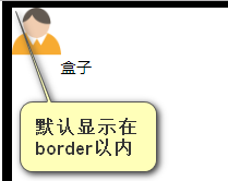
6.1 背景起源origin
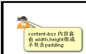
background-origin: content-box;(内容盒)
不设置content-box背景图默认背景起源位置是border以内。
设置content-box 背景图显示在内容盒以内。
1 | padding: 50px; |
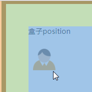
background-position:背景图相对于背景起源位置的偏移(向右10px 向下50px)
1 | background-position: 10px 50px; |
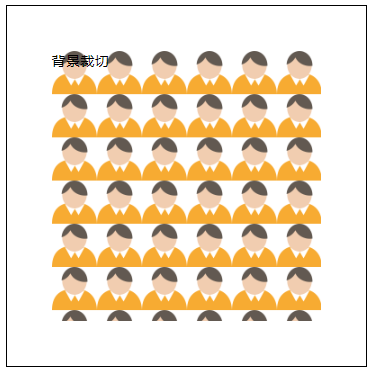
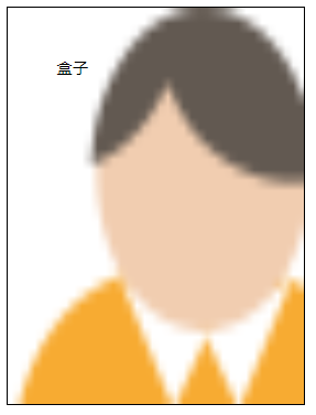
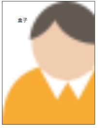
6.2 背景裁切 clip
background-clip:content-box;
表示将其他区域的背景裁切掉,只剩下内容盒背景图
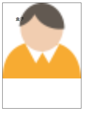
1 | background: url(images/people.png); |
等价写法:合并书写(未写no-repeat)
1 | background: url(images/people.png) content-box; |
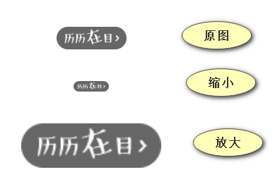
6.3 背景尺寸 size
background-size:背景宽度 背景高度;
调整背景图片尺寸,只写宽等比例调,宽高都写则使图片按照需要宽高尺寸调整。
6.3.1 像素表示法:
1 | background-size: 400px 500px; |
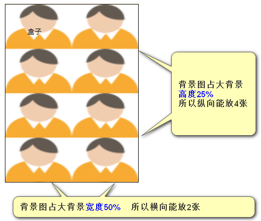
6.3.2 百分数表示法
background-size:背景图宽度相对于大背景宽度比值 背景图高度相对于大背景高度比值;
1 | background-size: 50% 25%; |
6.3.3 单词表示法
6.3.3.1 cover(覆盖,尽可能大)
背景图一定可以将大背景都覆盖住,并且背景图不会变形,等比例放大或缩小。背景图可能显示不完整。
1 | background-size: cover; |
6.3.3.2 contain(容纳,显示背景图的全部)
背景图一定可以显示完整,并且背景图不会变形,等比例放大或缩小。大背景可能会留白。
1 | background-size: contain; |
6.3.4 结合精灵图的使用
background-size 结合精灵图的使用:
①盒子宽高放大或缩小
②背景图放大或缩小 background-size
③精灵图位置放大或缩小background-position
1 | /*原精灵图*/ |
6.4 背景渐变
背景渐变使用的是background-image,而不是background-color
css3新的属性或者属性值处于试验阶段会添加浏览器前缀。
1 | -webkit- |
线性渐变:
linear 线性
gradient 渐变
1 | background-image: -前缀-linear-gradient(渐变起始方向,渐变颜色,渐变颜色,……); |
处于试验阶段完整写法:
1 | /* 渐变 上面是红色下面是绿色 (渐变处于试验阶段属性值,各浏览器都要加前缀) */ |
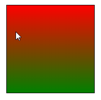
第一个参数:渐变开始方向(只需要写开始的方向,不要写结束方向)
左上角:top left
1 | background-image: -webkit-linear-gradient(top left,orange,pink); |
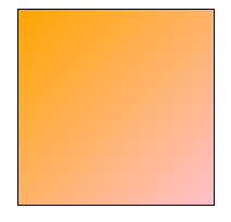
第二个参数:渐变颜色,可以用逗号隔开书写多个颜色
1 | background-image: -webkit-linear-gradient(right,orange,pink,green,red); |
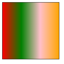
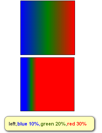
颜色后面可以用空格隔开百分数,表示该颜色在整体渐变中出现的位置。
1 | background-image: -webkit-linear-gradient(left,blue,green,red); |
6.5 多背景
一个元素可以渲染多个背景,用逗号隔开
其他单一属性也可以用逗号隔开,表示对应背景图设置
1 | width: 300px; |

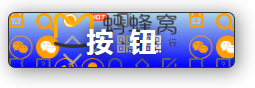
6.6 综合应用
先写普通精灵图片,再写渐变。否则无法单一对应渐变调整属性值 线性渐变无法写定位位置
1 | .btn { |