表格
1 基本实例 .table
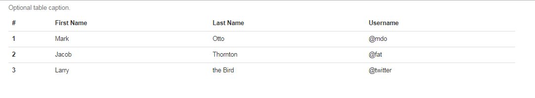
为任意 <table> 标签添加 .table 类可以为其赋予基本的样式 — 少量的内补(padding)和水平方向的分隔线。表格元素使用的很广泛,如果我们为其赋予默认样式可能会影响例如日历和日期选择之类的插件,所以我们选择将此样式独立出来。
1 | <table class="table"> |
2 条纹状表格 .table-striped
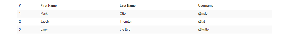
通过 .table-striped 类可以给 <tbody> 之内的每一行增加斑马条纹样式。
跨浏览器兼容性
条纹状表格是依赖 :nth-child CSS 选择器实现的,而这一功能不被 Internet Explorer 8 支持。
1 | <table class="table table-striped"> |
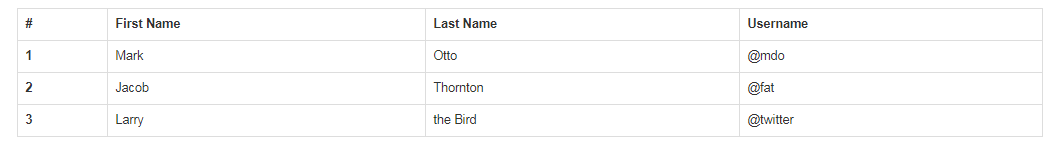
3 带边框的表格 .table-bordered
添加 .table-bordered 类为表格和其中的每个单元格增加边框。
1 | <table class="table table-bordered"> |
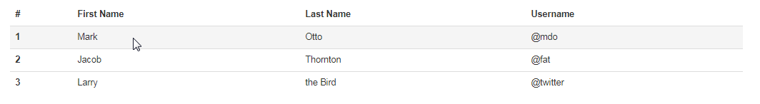
4 鼠标悬停 .table-hover
通过添加 .table-hover 类可以让 <tbody> 中的每一行对鼠标悬停状态作出响应。
1 | <table class="table table-hover"> |
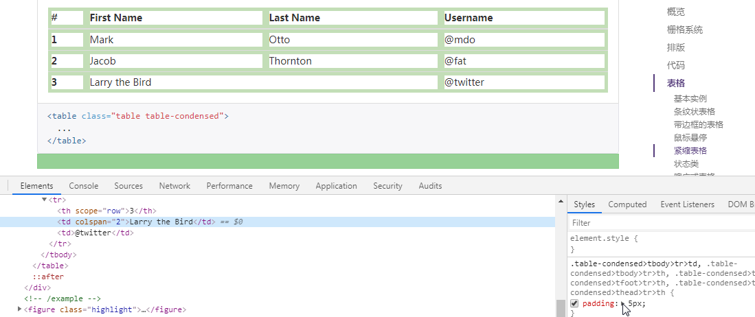
5 紧缩表格 .table-condensed
通过添加 .table-condensed 类可以让表格更加紧凑,单元格中的内补(padding)均会减半。
1 | <table class="table table-condensed"> |
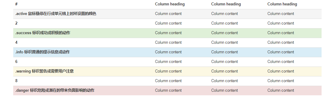
6 状态类
通过这些状态类可以为行或单元格设置颜色。
.active 鼠标悬停在行或单元格上时所设置的颜色
.success 标识成功或积极的动作
.info 标识普通的提示信息或动作
.warning 标识警告或需要用户注意
.danger 标识危险或潜在的带来负面影响的动作
1 | <table class="table"> |
1 | <!-- On rows --> |
向使用辅助技术的用户传达用意
通过为表格中的一行或一个单元格添加颜色而赋予不同的意义只是提供了一种视觉上的表现,并不能为使用辅助技术 – 例如屏幕阅读器 – 浏览网页的用户提供更多信息。因此,请确保通过颜色而赋予的不同意义可以通过内容本身来表达(即在相应行或单元格中的可见的文本内容);或者通过包含额外的方式 – 例如应用了 .sr-only 类而隐藏的文本 – 来表达出来。
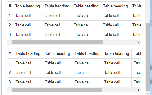
7 响应式表格 .table-responsive
将任何 .table 元素包裹在 .table-responsive 元素内,即可创建响应式表格,其会在小屏幕设备上(小于768px)水平滚动。当屏幕大于 768px 宽度时,水平滚动条消失。
1 | <div class="bs-example" data-example-id="simple-responsive-table"> |
7.1 垂直方向的内容截断
响应式表格使用了 overflow-y: hidden 属性,这样就能将超出表格底部和顶部的内容截断。特别是,也可以截断下拉菜单和其他第三方组件。
7.2 Firefox 和 fieldset 元素
Firefox 浏览器对 fieldset 元素设置了一些影响 width 属性的样式,导致响应式表格出现问题。可以使用下面提供的针对 Firefox 的 hack 代码解决,但是以下代码并未集成在 Bootstrap 中:
1 | fieldset:字段集;元素 |