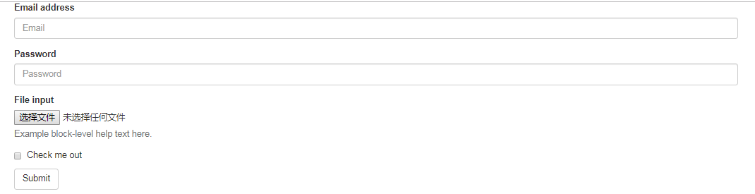
1 基本实例
单独的表单控件会被自动赋予一些全局样式。所有设置了 .form-control 类的 <input>、<textarea> 和 <select> 元素都将被默认设置宽度属性为 width: 100%;。 将 label 元素和前面提到的控件包裹在 .form-group 中可以获得最好的排列。
1 | <form> |
不要将表单组直接和输入框组混合使用。建议将输入框组嵌套到表单组中使用。
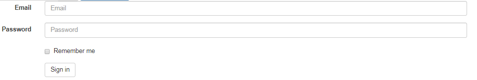
2 内联表单
为 <form> 元素添加 .form-inline 类可使其内容左对齐并且表现为 inline-block 级别的控件。只适用于视口(viewport)至少在 768px 宽度时(视口宽度再小的话就会使表单折叠)。
2.1 可能需要手动设置宽度
在 Bootstrap 中,输入框和单选/多选框控件默认被设置为 width: 100%; 宽度。在内联表单,我们将这些元素的宽度设置为 width: auto;,因此,多个控件可以排列在同一行。根据你的布局需求,可能需要一些额外的定制化组件。
2.2 一定要添加 label 标签
如果你没有为每个输入控件设置 label 标签,屏幕阅读器将无法正确识别。对于这些内联表单,你可以通过为 label 设置 .sr-only 类将其隐藏。还有一些辅助技术提供label标签的替代方案,比如 aria-label、aria-labelledby 或 title 属性。如果这些都不存在,屏幕阅读器可能会采取使用 placeholder 属性,如果存在的话,使用占位符来替代其他的标记,但要注意,这种方法是不妥当的。
1 | <form class="form-inline"> |

1 | <form class="form-inline"> |

1 | <form class="form-inline"> |
3 水平排列的表单
通过为表单添加 .form-horizontal 类,并联合使用 Bootstrap 预置的栅格类,可以将 label 标签和控件组水平并排布局。这样做将改变 .form-group 的行为,使其表现为栅格系统中的行(row),因此就无需再额外添加 .row 了。
1 | <form class="form-horizontal"> |
4 被支持的控件
表单布局实例中展示了其所支持的标准表单控件。
4.1 输入框
包括大部分表单控件、文本输入域控件,还支持所有 HTML5 类型的输入控件: text、password、datetime、datetime-local、date、month、time、week、number、email、url、search、tel 和 color。
必须添加类型声明:
只有正确设置了 type 属性的输入控件才能被赋予正确的样式。
1 | <input type="text" class="form-control" placeholder="Text input"> |
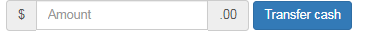
输入控件组:
如需在文本输入域 <input> 前面或后面添加文本内容或按钮控件,请参考输入控件组。
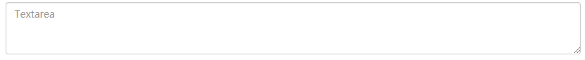
4.2 文本域
支持多行文本的表单控件。可根据需要改变 rows 属性。
1 | <textarea class="form-control" rows="3"></textarea> |
4.3 多选和单选框
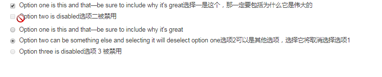
多选框(checkbox)用于选择列表中的一个或多个选项,而单选框(radio)用于从多个选项中只选择一个。
支持禁用的复选框和单选框,但要在父项<label>悬停时提供“不允许”光标,需要将.Disabled类添加到父项.radio、.radio inline、.checkbox或.checkbox inline。
4.3.1 默认外观(堆叠在一起)
1 | <div class="checkbox"> |
4.3.2 内联单选和多选框
通过将 .checkbox-inline 或 .radio-inline 类应用到一系列的多选框(checkbox)或单选框(radio)控件上,可以使这些控件排列在一行。
1 | <label class="checkbox-inline"> |

4.3.3 不带label文本的Checkbox 和 radio
如果需要 <label> 内没有文字,输入框(input)正是你所期望的。 目前只适用于非内联的 checkbox 和 radio。 请记住,仍然需要为使用辅助技术的用户提供某种形式的 label(例如,使用 aria-label)。
1 | <div class="checkbox"> |

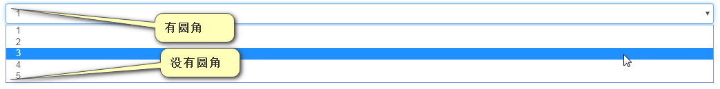
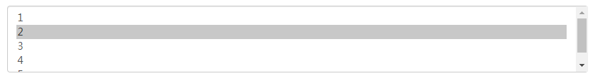
4.4 下拉列表(select)
注意,很多原生选择菜单 - 即在 Safari 和 Chrome 中 - 的圆角是无法通过修改 border-radius 属性来改变的。
1 | <select class="form-control"> |
对于标记了 multiple 属性的 <select> 控件来说,默认显示多选项。
1 | <select multiple class="form-control"> |
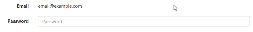
5 静态控件
如果需要在表单中将一行纯文本和 label 元素放置于同一行,为 <p> 元素添加 .form-control-static 类即可。
1 | <form class="form-horizontal"> |
1 | <form class="form-inline"> |

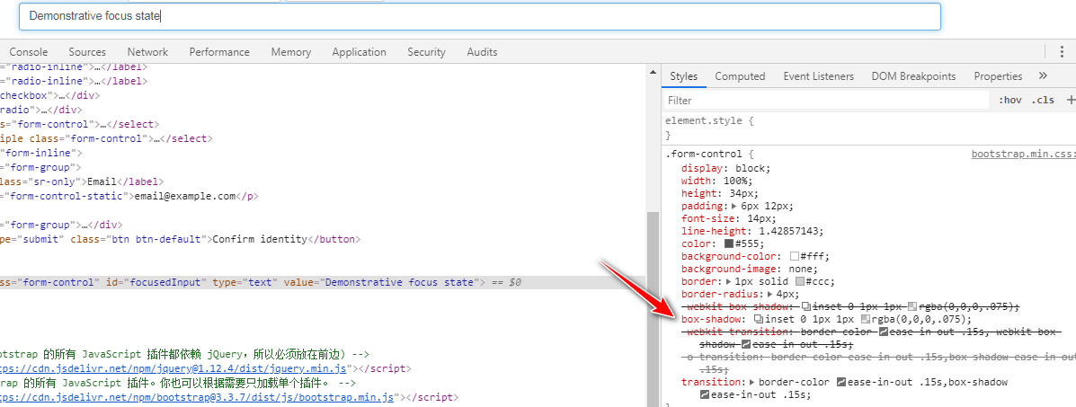
6 焦点状态
我们将某些表单控件的默认 outline 样式移除,然后对 :focus 状态赋予 box-shadow 属性。
1 | <form> |
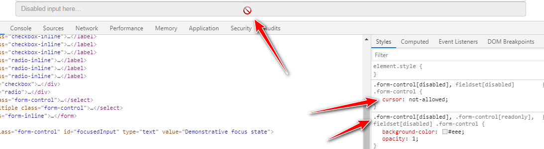
7 禁用状态
为输入框设置 disabled 属性可以禁止其与用户有任何交互(焦点、输入等)。被禁用的输入框颜色更浅,并且还添加了 not-allowed 鼠标状态。
1 | <form> |
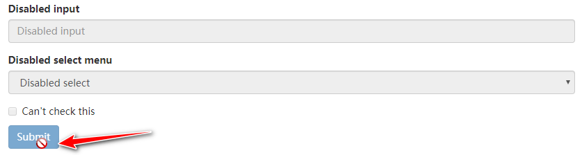
7.1 被禁用的 fieldset
为<fieldset> 设置 disabled 属性,可以禁用 <fieldset> 中包含的所有控件。
7.2 <a> 标签的链接功能不受影响 :
默认情况下,浏览器会将 <fieldset disabled> 内所有的原生的表单控件(<input>、<select> 和 <button> 元素)设置为禁用状态,防止键盘和鼠标与他们交互。然而,如果表单中还包含 <a ... class="btn btn-*"> 元素,这些元素将只被赋予 pointer-events: none 属性。正如在关于 禁用状态的按钮 章节中(尤其是关于锚点元素的子章节中)所描述的那样,该 CSS 属性尚不规范,并且在 Opera 18 及更低版本的浏览器或 Internet Explorer 11 总没有得到全面支持,并且不会阻止键盘用户能够获取焦点或激活这些链接。所以为了安全起见,建议使用自定义 JavaScript 来禁用这些链接。
7.3 跨浏览器兼容性
虽然 Bootstrap 会将这些样式应用到所有浏览器上,Internet Explorer 11 及以下浏览器中的 <fieldset> 元素并不完全支持 disabled 属性。因此建议在这些浏览器上通过 JavaScript 代码来禁用 <fieldset>。
1 | <form> |
8 只读状态
为输入框设置 readonly 属性可以禁止用户修改输入框中的内容。处于只读状态的输入框颜色更浅(就像被禁用的输入框一样),但是仍然保留标准的鼠标状态。
1 | <input class="form-control" type="text" placeholder="Readonly input here…" readonly> |

9 Help text
Block level help text for form controls. 窗体控件的块级帮助文本
Associating help text with form controls将帮助文本与表单控件关联
帮助文本应该显式地与表单控件关联,该控件与使用aria-describedby属性(aria-describedby="helpBlock")相关。这将确保辅助技术(如屏幕阅读器)在用户聚焦或进入控件时公布此帮助文本。
1 | <form> |

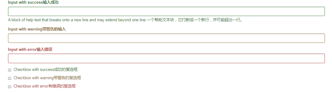
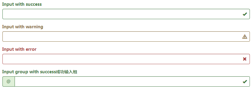
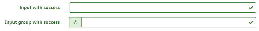
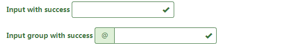
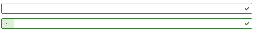
10 校验状态
Bootstrap 对表单控件的校验状态,如 error、warning 和 success 状态,都定义了样式。使用时,添加 .has-warning、.has-error 或 .has-success 类到这些控件的父元素即可。任何包含在此元素之内的 .control-label、.form-control 和 .help-block 元素都将接受这些校验状态的样式。
10.1 将验证状态传达给辅助设备和盲人用户
使用这些校验样式只是为表单控件提供一个可视的、基于色彩的提示,但是并不能将这种提示信息传达给使用辅助设备的用户 - 例如屏幕阅读器 - 或者色盲用户。
为了确保所有用户都能获取正确信息,Bootstrap 还提供了另一种提示方式。例如,你可以在表单控件的 <label> 标签上以文本的形式显示提示信息(就像下面代码中所展示的);包含一个 Glyphicon 字体图标 (还有赋予 .sr-only 类的文本信息 - 参考Glyphicon 字体图标实例);或者提供一个额外的 辅助信息 块。另外,对于使用辅助设备的用户,无效的表单控件还可以赋予一个 aria-invalid="true" 属性。
1 | <div class="form-group has-success"> |
10.2 添加额外的图标
你还可以针对校验状态为输入框添加额外的图标。只需设置相应的 .has-feedback 类并添加正确的图标即可。
反馈图标(feedback icon)只能使用在文本输入框 <input class="form-control"> 元素上。
10.2.1 图标、label 和输入控件组
对于不带有 label 标签的输入框以及右侧带有附加组件的输入框组,需要手动为其图标定位。为了让所有用户都能访问你的网站,我们强烈建议为所有输入框添加 label 标签。如果你不希望将 label 标签展示出来,可以通过添加 .sr-only 类来实现。如果的确不能添加 label 标签,请调整图标的 top 值。对于输入框组,请根据你的实际情况调整 right 值。
10.2.2 向辅助技术设备传递图标的含义
为了确保辅助技术- 如屏幕阅读器 - 正确传达一个图标的含义,额外的隐藏的文本应包含在 .sr-only 类中,并明确关联使用了 aria-describedby 的表单控件。或者,以某些其他形式(例如,文本输入字段有一个特定的警告信息)传达含义,例如改变与表单控件实际相关联的 <label> 的文本。
虽然下面的例子已经提到各自表单控件本身的 <label> 文本的验证状态,上述技术(使用 .sr-only 文本 和 aria-describedby) )已经包括了需要说明的目的。
1 | <div class="form-group has-success has-feedback"> |
10.2.3 为水平排列的表单和内联表单设置可选的图标
1 | <form class="form-horizontal"> |
1 | <form class="form-inline"> |
10.2.4 可选的图标与设置 .sr-only 类的 label
如果你使用 .sr-only 类来隐藏表单控件的 <label> (而不是使用其它标签选项,如 aria-label 属性), 一旦它被添加,Bootstrap 会自动调整图标的位置。
1 | <div class="form-group has-success has-feedback"> |
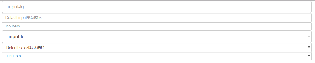
11 控件尺寸
通过 .input-lg 类似的类可以为控件设置高度,通过 .col-lg-* 类似的类可以为控件设置宽度。
11.1 高度尺寸
创建大一些或小一些的表单控件以匹配按钮尺寸。
1 | <form> |
11.2 水平排列的表单组的尺寸
通过添加 .form-group-lg 或 .form-group-sm 类,为 .form-horizontal 包裹的 label 元素和表单控件快速设置尺寸。
1 | <form class="form-horizontal"> |

11.3 调整列(column)尺寸
用栅格系统中的列(column)包裹输入框或其任何父元素,都可很容易的为其设置宽度。
1 | <div class="row"> |
