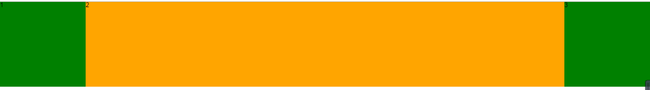
八、移动端常用模型

八、移动端常用模型

8.1 固比固模型

固比固模型:

第一和第三部分宽度确定,第二部分宽度自适应。

8.1.1 浮动方法:

1
2
3
4
5
6
7
8
9
10
11
12
13
14
.box {
width: 100%;
overflow: hidden;
}
.box p {
float: left;
width: 200px;
height: 200px;
background-color: green;
}
.box p.no2 {
width: calc(100% - 400px);
background-color: orange;
}

NIdFJK.png

8.1.2 绝对定位方法(常用):

1
2
3
4
5
6
7
8
9
10
11
12
13
14
15
16
17
18
19
20
21
22
23
24
25
26
27
28
29
30
31
32
33
34
35
.box {
/* 相对于父盒子内容宽的比值 */
/* 内减盒模型 width 表示最终实际占有宽度 */
width: 100%;
height: 200px;
position: relative;
/* 用父盒子padding挤出 no1 和 no3 的位置 */
padding: 0px 200px;
/* 内减盒模型 */
box-sizing: border-box;
}
.box .no1 {
/* 绝对定位 左侧 */
width: 200px;
height: 200px;
position: absolute;
left: 0px;
top: 0px;
background-color: green;
}
.box .no3 {
/* 绝对定位 右侧 */
width: 200px;
height: 200px;
position: absolute;
right: 0px;
top: 0px;
background-color: green;
}
.box .no2 {
/* 标准流 绝对定位脱标 让出标准流的位置 */
background-color: orange;
height: 200px;
width: 100%;
}

NIdFJK.png

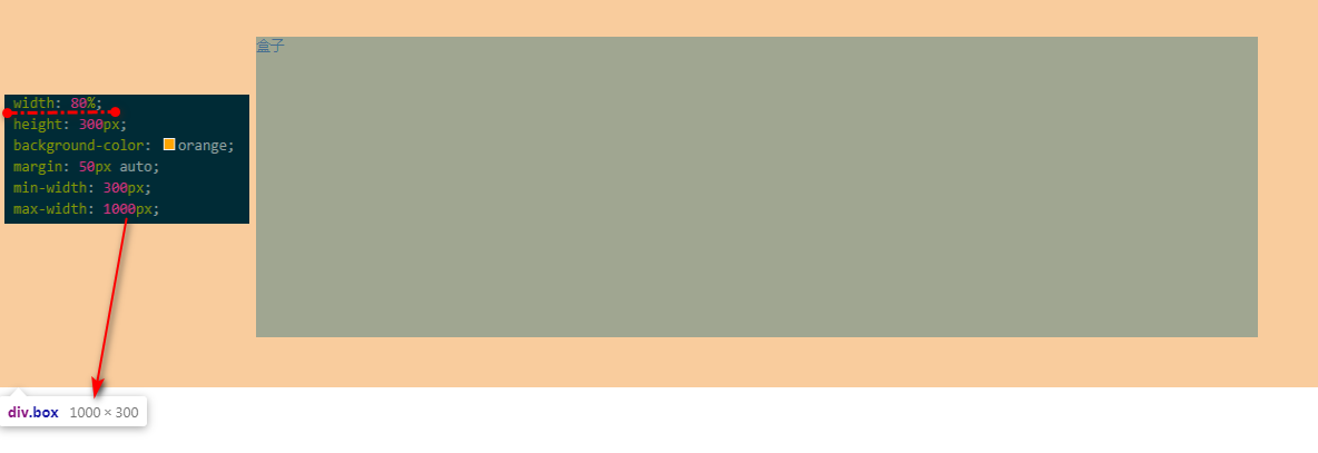
8.2 min-width 和 max-width

移动端书写宽度一般使用百分数,但是对于最小宽度min-width 和最大宽度 max-width 只能使用像素值。

当百分数的结果在最大值和最小值之间时,按百分比的结果显示

当百分数的结果超出最大值和最小值时,按最大值或最小值显示

1
2
3
4
5
6
7
8
.box {
width: 80%;
height: 300px;
background-color: orange;
margin: 50px auto;
min-width: 300px;
max-width: 1000px;
}

NIdGQg.png

点击查看

本文标题:八、移动端常用模型

文章作者:Mango

发布时间:2020年06月30日 - 21:41:08

最后更新:2020年06月30日 - 21:44:19

原始链接:https://mango185.github.io/post/e4cf004f.html

许可协议: 署名-非商业性使用-禁止演绎 4.0 国际 转载请保留原文链接及作者。

-------------------本文结束 感谢您的阅读-------------------