九、响应式网页制作
9.1 概念
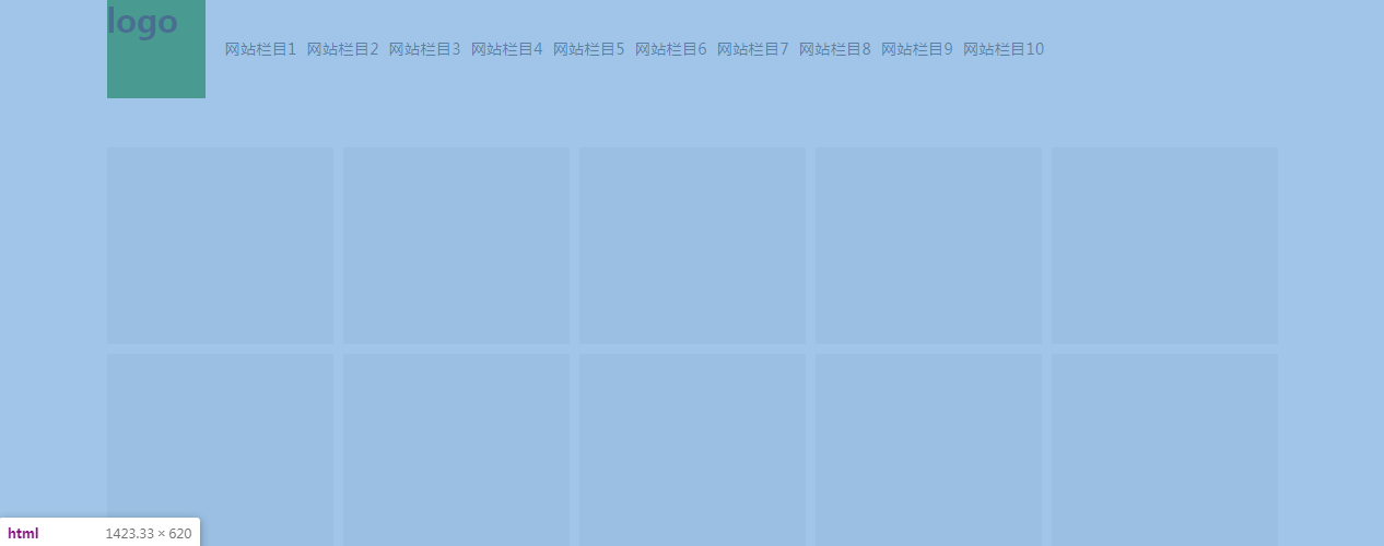
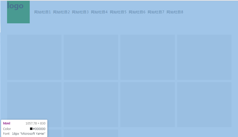
同一个网页根据视口的不同,显示不同的版式。
响应式网页制作:responsive web design (RWD)
9.2 优缺点
优点:
对于不同视口都可以显示非常饱满的网页结构,没有横向滚动条。
缺点:
制作复杂,同时对于移动端而言,需要加载非常多的pc端的样式和图片等资源,影响加载速度,同时费流量。(国内没有纯响应式网站)
9.3 原理
同一个HTML页面根据视口不同加载不同CSS
CSS3可以使用媒体查询完成。
9.3.1 外链式媒体查询
外链式加载CSS
media:媒体
screen:屏幕
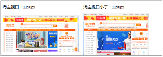
min-width:最小宽度,表示当视口大于或等于改值时,加载CSS
max-width:最大宽度,表示当视口小0于或等于改值时,加载CSS
1 | <!-- 所有视口都加载 01.css --> |
视口可以分为多个端口
>= 1200px
1199px >= 视口 >= 700px
<= 699px
1 | <!-- 媒体查询 --> |
“留活口”:对于IE不兼容media,需要书写一个不添加media
如果不书写media ,表示所有视口都加载media
1 | <!-- 留活口语句必须先书写 所有视口都加载 01.css 可以将公共样式写在这里 简化代码--> |
9.3.2 内嵌式媒体查询
@media screen and (视口) { }
1 | /* 清除默认样式 */ |
9.3 练习
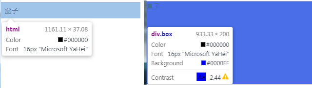
1 | <div class="header"> |
01.css :
1 | /* 清楚默认样式 */ |
02.css :
1 | .header { |