十二、3D相册
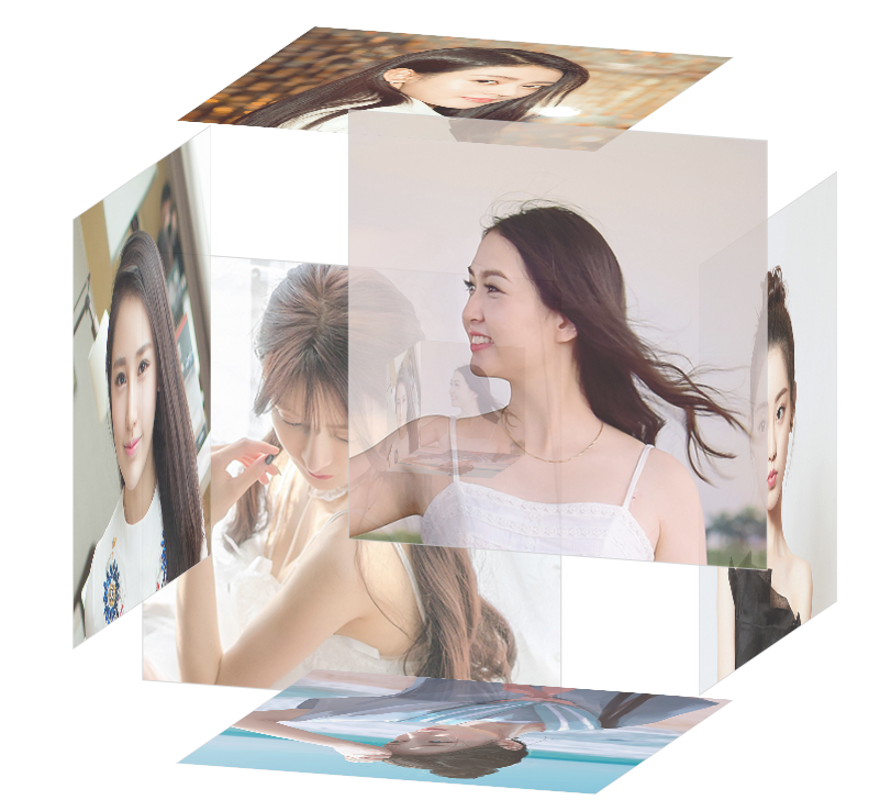
鼠标移到上面的效果:
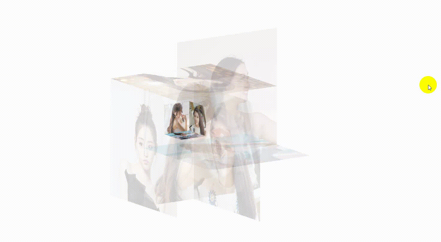
鼠标离开的效果:
附上源码下载地址(提取码:fkxu):
index.html
1 |
|
index.css
1 | @charset "utf-8"; |
鼠标移到上面的效果:
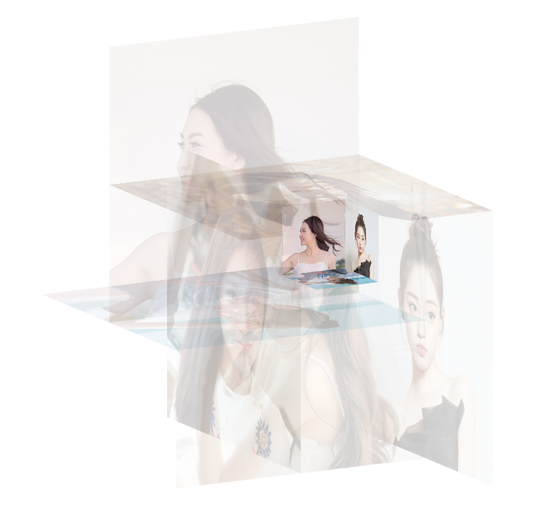
鼠标离开的效果:
附上源码下载地址(提取码:fkxu):
index.html
1 |
|
index.css
1 | @charset "utf-8"; |
本文标题:十二、3D相册
文章作者:Mango
发布时间:2020年07月14日 - 13:14:27
最后更新:2020年07月14日 - 13:27:10
原始链接:https://mango185.github.io/post/7935021a.html
许可协议: 署名-非商业性使用-禁止演绎 4.0 国际 转载请保留原文链接及作者。