说白了就是媒体查询和百分比布局
bootstrap包含了一个响应式的、移动设备优先的、不固定的网格系统,可以随着设备或视口大小的增加而适当的扩展到12列。它包含了用于简单的布局选项的预定义类,也包含了用于生成更多语义布局的功能强大的混合类。
1 | bootstrap3是移动设备优先 |
在通常我们写的页面里,浏览器缩小到一定程度,页面会错位、变形,这在bootstrap中不会,因为他是自适应的。
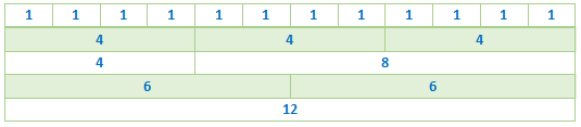
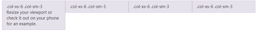
下图是栅格系统,它最多可以分为12列,你可以按自己喜欢的比例来划分页面,只要它们加起来不超过12。
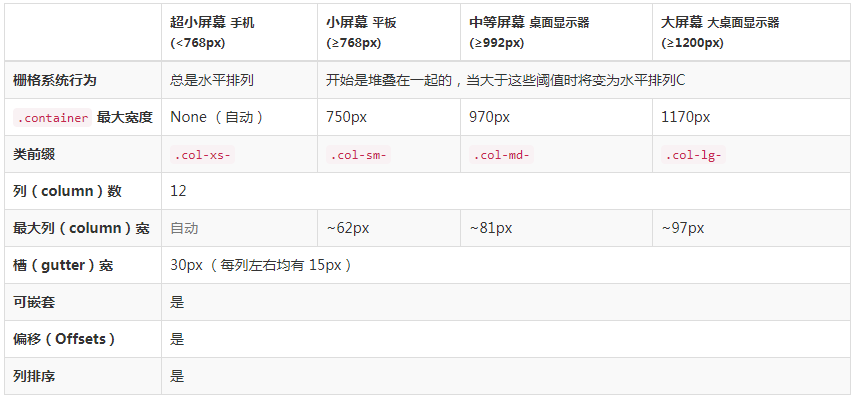
1、栅格参数
通过下表可以详细查看 Bootstrap 的栅格系统是如何在多种屏幕设备上工作的。
2、类名说明
容器:container(固定宽度)(版心) container-fluid(100%)(通栏)
行:row
列:col-xs-5 col-sm col-md col-lg
“行(row)”必须包含在 .container (固定宽度)或 .container-fluid (100% 宽度)中,以便为其赋予合适的排列(aligment)和内补(padding)。
通过“行(row)”在水平方向创建一组“列(column)”。
内容应当放置于“列(column)”内,并且,只有“列(column)”可以作为行(row)”的直接子元素。
类似 .row 和 .col-xs-4 这种预定义的类,可以用来快速创建栅格布局。Bootstrap 源码中定义的 mixin 也可以用来创建语义化的布局。
通过为“列(column)”设置 padding 属性,从而创建列与列之间的间隔(gutter)。通过为 .row 元素设置负值 margin 从而抵消掉为 .container 元素设置的 padding,也就间接为“行(row)”所包含的“列(column)”抵消掉了padding。
负值的 margin就是下面的示例为什么是向外突出的原因。在栅格列中的内容排成一行。
栅格系统中的列是通过指定1到12的值来表示其跨越的范围。例如,三个等宽的列可以使用三个 .col-xs-4 来创建。
如果一“行(row)”中包含了的“列(column)”大于 12,多余的“列(column)”所在的元素将被作为一个整体另起一行排列。
栅格类适用于与屏幕宽度大于或等于分界点大小的设备 , 并且针对小屏幕设备覆盖栅格类。 因此,在元素上应用任何 .col-md-* 栅格类适用于与屏幕宽度大于或等于分界点大小的设备 , 并且针对小屏幕设备覆盖栅格类。 因此,在元素上应用任何 .col-lg-* 不存在, 也影响大屏幕设备。
3、案例
1 | <!-- 版心 bootstrap中叫做容器 --> |
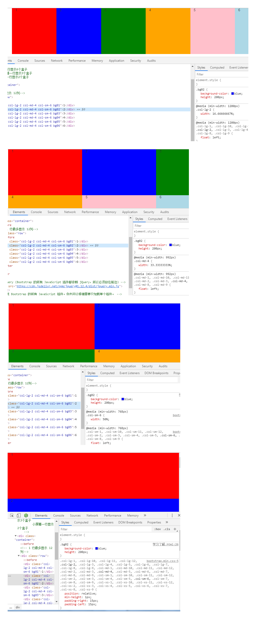
1 | <!-- lg 大屏幕一行显示6个盒子 |
4、实例:从堆叠到水平排列
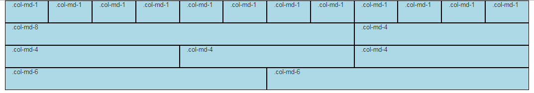
使用单一的一组 .col-md-* 栅格类,就可以创建一个基本的栅格系统,在手机和平板设备上一开始是堆叠在一起的(超小屏幕到小屏幕这一范围),在桌面(中等)屏幕设备上变为水平排列。所有“列(column)必须放在 ” .row 内。
1 | <div class="container"> |
5、实例:流式布局容器
将最外面的布局元素 .container 修改为 .container-fluid,就可以将固定宽度的栅格布局转换为 100% 宽度的布局。
1 | <div class="container-fluid"> |

6、实例:移动设备和桌面屏幕
是否不希望在小屏幕设备上所有列都堆叠在一起?那就使用针对超小屏幕和中等屏幕设备所定义的类吧,即 .col-xs-* 和 .col-md-*。
1 | <div class="container"> |

7、实例:手机、平板、桌面
在上面案例的基础上,通过使用针对平板设备的 .col-sm-* 类,来创建更加动态和强大的布局吧。
1 | <div class="container"> |

注:预定义类 clearfix visible-xs-block的作用
1.不使用clearfix和visible-xs-block
1 |
|
2.使用了clearfix和visible-xs-block类之后
1 |
|
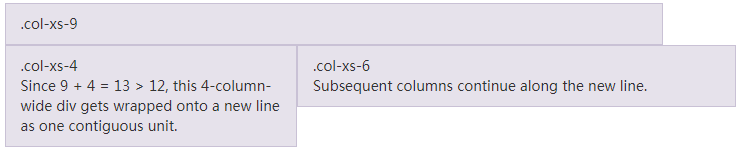
8、实例:多余的列(column)将另起一行排列
如果在一个 .row 内包含的列(column)大于12个,包含多余列(column)的元素将作为一个整体单元被另起一行排列。
1 | <div class="row"> |
9、响应式列重置
即便有上面给出的四组栅格class,你也不免会碰到一些问题,例如,在某些阈值时,某些列可能会出现比别的列高的情况。为了克服这一问题,建议联合使用 .clearfix 和 响应式工具类。
1 | <div class="row"> |
除了列在分界点清除响应, 可能需要 重置偏移, 后推或前拉某个列。
1 | <div class="row"> |
10、列偏移
使用 .col-md-offset-* 类可以将列向右侧偏移。这些类实际是通过使用 * 选择器为当前元素增加了左侧的边距(margin)。例如,.col-md-offset-4 类将 .col-md-4 元素向右侧偏移了4个列(column)的宽度。
1 | <div class="row"> |
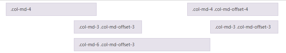
还可以使用.col-*-offset-0类覆盖较低网格层的偏移量。
1 | <div class="row"> |
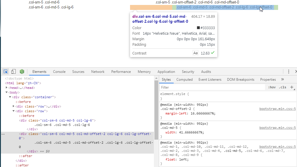
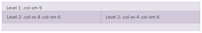
11、嵌套列
为了使用内置的栅格系统将内容再次嵌套,可以通过添加一个新的 .row 元素和一系列 .col-sm-* 元素到已经存在的 .col-sm-* 元素内。被嵌套的行(row)所包含的列(column)的个数不能超过12(其实,没有要求你必须占满12列)。
1 | <div class="row"> |
12、列排序
通过使用 .col-md-push-* 和 .col-md-pull-* 类就可以很容易的改变列(column)的顺序。
1 | <div class="row"> |

13 Less mixin 和变量
除了用于快速布局的预定义栅格类,Bootstrap 还包含了一组 Less 变量和 mixin 用于帮你生成简单、语义化的布局。
13.1 变量
通过变量来定义列数、槽(gutter)宽、媒体查询阈值(用于确定合适让列浮动)。我们使用这些变量生成预定义的栅格类,如上所示,还有如下所示的定制 mixin。
1 | @grid-columns: 12; |
13.2 mixin
mixin 用来和栅格变量一同使用,为每个列(column)生成语义化的 CSS 代码。
1 | // Creates a wrapper for a series of columns |
13.3 实例展示
你可以重新修改这些变量的值,或者用默认值调用这些 mixin。下面就是一个利用默认设置生成两列布局(列之间有间隔)的案例。
1 | { |