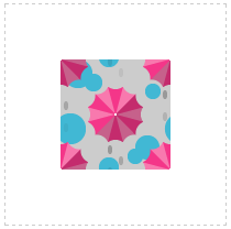
十一、背景相关属性

1 background-repeat

默认情况下,背景图片会平铺

Background 是背景的意思,repeat 是重复的意思

Background-repeat 属性用来设置背景的重复情形,一共有三种情形

1
2
3
4
5
6
7
8
9
10
11
12
<style>
  .box{
    width: 500px;
    height: 500px;
background-image: url(images/girl.png);
border: 1px solid black;
  }
</style>
</head>
<body>
  <div class="box"></div>
</body>

tTgSG8.png

1
2
3
4
5
6
7
8
9
10
11
.box{
    width: 500px;
    height: 500px;
    background-image: url(images/girl.png);
    border: 1px solid black;
    background-repeat: repeat-y;
  }
</style>
</head>
<body>
  <div class="box"></div>

tTgNRO.png

1
2
3
4
5
6
7
8
9
10
11
.box{
    width: 500px;
    height: 500px;
    background-image: url(images/girl.png);
    border: 1px solid black;
    background-repeat: no-repeat;
  }
</style>
</head>
<body>
  <div class="box"></div>

tTg0Ld.png

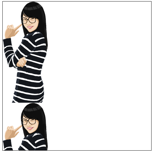
我们可以制作一个1px宽度的图片,然后设置为body的背景图片,设置repeat-x仅横向平铺

1
2
3
4
5
6
7
8
9
10
11
12
13
14
15
16
body{
    background-image: url(images/bj.fw.png);
    background-repeat: repeat-x;
  }
  .box{
    width: 500px;
    height: 500px;
    background-image: url(images/girl.png);
    border: 1px solid black;
    background-repeat: no-repeat;
  }
</style>
</head>
<body>
  <div class="box"></div>
</body>

tTgfyQ.png

2 background-position

背景图片定位

除了背景背景平铺外,CSS还提供了另一个强大的功能,即背景定位技术,能够精确控制背景在对象中的位置。

默认情况下,背景图像都是从元素 padding 区域的左上角开始出现的,但设计师往往希望背景能够出现在任何位置。通过 background-position属性,可以很轻松的控制背景图像在对象的背景区域中的起始显示位置。其语法格式为:

1
background-position: xpos ypos | x% y% | x y

CSS1中,background-position属性需要 2 个参数值,第一个值用于横坐标,第二个值用于纵坐标,默认值为 0% 0%,即背景图像的左上角与对象背景区域的左上角对齐。如果只提供一个值,则用于 x 轴方向,y 轴方向使用默认值 center,即垂直居中。

上述语法格式表明,背景图像有 3 种定位方式:

1)关键字定位

水平方向可选关键字有 left | center | right,垂直方向可选关键字有 top | center | bottom。

关键字定位,应用的是对齐规则,而不是坐标规则。

left 表示图像的左边与对象的左边对齐,为 right 表示图像的右边和对象的右边对齐;

top 表示图像的顶部和对象的顶部对齐,为 bottom 表示图像的底部和对象的底部对齐;

center 表示图像在水平和垂直方向的中心,和对象在水平和垂直方向的中心对齐。

例如背景图案 bg.gif,其尺寸为 100px * 100px,对象的尺寸为 200px * 200px,背景图像的位置使用预定义关键字定位。如:

1
2
3
4
5
6
7
8
div {
width: 200px;
height: 200px;
border: 1px dashed #ccc;
background-repeat: no-repeat;
background-position: center center;
background-image: url(img/bg.gif);
}

t7FuE4.png

上述定位,就表示背景图像的中心,与背景区域的中心对齐,即背景图像位于对象的中央位置。

合写在一起时可以这样写(与上面的定位内容无关):

1
background:url(images/girl.png) no-repeat right bottom

2)百分比定位

x% y%:表示使用百分比定位,是将图像本身(x%, y%)的那个点,与背景区域的(x%, y%)的那个点重合。最终得到背景图像起始位置坐标的计算公式为:

1
2
3
x = (对象的宽度 - 图像的宽度) * x%;

y = (对象的高度 - 图像的高度) * y%;

还是上面的例子,改为百分比定位,要使背景图像居中,只需把背景图像的位置设置为50% 50% 即可。使用上面的公式,得到背景图像起始位置的坐标为:

1
2
3
x:(200px - 100px) * 50%  = 100px * 50% = 50px

y:(200px - 100px) * 50%  = 100px * 50% = 50px

得到的结果与上例相同。

当然,百分比的值也可以是负值,计算公式依然不变。还是上面的例子,把百分比改为 -50% -50%。此时,得到背景图像起始位置的坐标为:

1
2
3
x:(200px - 100px) * (-50%) = 100px * (-50%) = -50px

y:(200px - 100px) * (-50%) = 100px * (-50%) = -50px

t7F2Vg.png

从上图可以看出,此时的背景图像只显示了原本图像的 1/4,这是因为背景图像的起始位置向左、向上移动后,只有1/4 的图案落到了背景区域。由于背景被设置为不重复,所以,就只显示了原本图像的 1/4。

3)使用长度值定位

x y:表示使用长度值定位,是将背景图像的左上角,放置在对象的背景区域中(x, y)所指定的位置,即 x, y 定义的是背景图像的左上角,相对于背景区域左上角的偏移量。

偏移量长度可以是正值,也可以是负值。x 为正值表示向右偏移,负值表示向左偏移;y 为正值表示向下偏移,负值表示向上偏移。背景图像发生移动后,就有可能超出对象的背景区域。此时,超出的部分将不会显示,只会显示落入背景区域的部分。

如果把上面的例子改为长度值定位,要使背景图像居中,只需把背景图像的位置设置为50px 50px 即可。它就表示背景图像的左上角顶点,相对于对象背景区域的左上角顶点在 x轴右移 50px,在 y 轴下移 50px。得到的结果依然是背景图像位于对象的中央。

在CSS3中,background-position属性支持 4 个参数值,前两个值用于横坐标,后两个值用于纵坐标。这意味着我们可以相对于上左下右任意一个角落定位,而不是之前只能相对于左上角定位。可以用长度值、或百分比来指定背景图像的起始位置。

如果只提供一个值,则第二个值为center。如果提供两个值,第一个长度或百分比表示水平偏移,第二个长度或百分比表示垂直偏移。长度或百分比,表示背景图像的左上角相对于背景位置区域左上角的偏移。如,下面几个声明给出了背景的起点相对于背景区域左上角的偏移:

1
2
3
4
5
6
7
background-position: left 10px top 15px; /* 10px, 15px */
background-position: left top ; /* 0px, 0px */
background-position: 10px 15px; /* 10px, 15px */
background-position: left 15px; /* 0px, 15px */
background-position: 10px top ; /* 10px, 0px */
background-position: left top 15px; /* 0px, 15px */
background-position: left 10px top ; /* 10px, 0px */

3 精灵

如果背景图片的尺寸是900多1000多,但是盒子只有250250,此时盒子势必只能呈现背景图片的某一部分

使用background-position属性可以调整背景图片的位置,通过设置值为负数,可以向左、向上拉动背景图片

1
2
3
4
5
6
7
8
9
10
11
 .box{
    width: 250px;
    height: 250px;
    border:1px solid red;
    background:url(images/boya.png) no-repeat -200px -30px;
  }
</style>
</head>
<body>
  <div class="box"></div>
</body>
1
2
3
4
5
6
.box{
    width101px;
    height97px;
    border:1px solid red;
    background:url(images/boya.png) no-repeat -382px -16px;
  }

CSS精灵的英文解释

1
2
3
CSS Image Sprite
 An image sprite is a collection of images put into a single image. Aweb page with many images can take a long time to load and generates multiple server requests. Usingimage sprites will reduce the number of server requests and save bandwidth.
图像精灵是将图像放入单个图像中的集合。一个包含多个图像的网页需要很长时间才能加载并生成多个服务器请求。使用图像精灵将减少服务器请求的数量和节省带宽。

精灵也叫雪碧技术

1
2
3
4
5
6
7
8
9
10
11
12
13
14
15
16
17
<style>
  .re{
    width: 16px;
    height: 18px;
    background:url(images/baidujingling.png) no-repeat 0px -451px;
  }
  .kai{
    width: 33px;
    height: 19px;
    background:url(images/baidujingling.png) no-repeat 0px -650px;
  }
</style>
</head>
<body>
  <div class="re"></div>
  <div class="kai"></div>
</body>

上传图床失败,没图了 ε=ε=ε=ε=ε=ε=┌(; ̄◇ ̄)┘

4 钩子

精灵有一个非常重要的使用方法,就是使用CSS钩子
曾几何时,有几个标签:b用来加粗 u用来加下划线 i用来倾斜

1
2
3
4
5
6
<p>
    正常文字
    <b>加粗</b>
    <u>下划线</u>
    <i>倾斜</i>
  </p>

现在已经被CSS取代了,比如加粗用font-weight:bold; 下划线text-decoration:underline;
现在可以用来当做钩子,勾住背景图片,通常伴随绝对定位!!

1
2
3
4
5
6
7
8
9
10
11
12
13
14
15
16
17
18
19
20
21
22
23
24
 ul{
    list-style: none;
  }
  ul li{
    position: relative;
  }
  ul li b{
    position: absolute;
    top:6px;
    left:-15px;
    width: 10px;
    height: 10px;
    background: red;
  }
</style>
</head>
<body>
  <ul>
    <li><b></b>文字文字文字</li>
    <li><b></b>文字文字文字</li>
    <li><b></b>文字文字文字</li>
    <li><b></b>文字文字文字</li>
  </ul>
</body>
1
2
3
4
5
6
7
8
9
10
11
12
13
14
15
16
17
18
19
20
21
22
23
24
 ul{
    list-style: none;
  }
  ul li{
    position: relative;
  }
  ul li b{
    position: absolute;
    top:4px;
    left:-15px;
    width: 12px;
    height: 12px;
    background:url(images/baidu.png) no-repeat 0 0;
  }
</style>
</head>
<body>
  <ul>
    <li><b></b>文字文字文字</li>
    <li><b></b>文字文字文字</li>
    <li><b></b>文字文字文字</li>
    <li><b></b>文字文字文字</li>
  </ul>
</body>

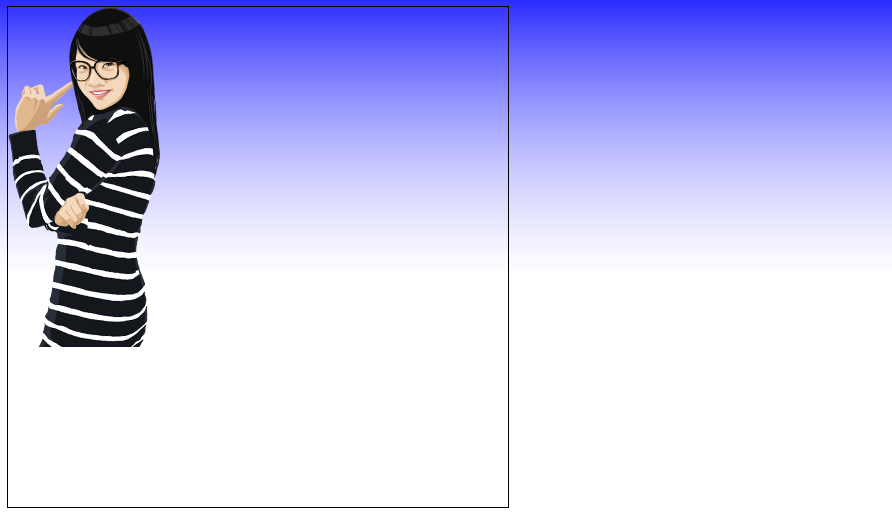
5 background-attachment

背景图是否卷动(只能应用在body中

默认:

scroll 背景图跟随页面滚动而卷动

fixed 背景图不跟随页面的滚动而卷动 固定

1
2
3
4
5
6
7
8
9
10
11
12
13
14
15
16
17
18
19
20
21
22
23
24
25
26
27
 body{
            background-image:url(images/22.jpg);
            background-repeat: no-repeat;
            background-attachment: fixed;
        }
        .box {
            width: 200px;
            height: 200px;
            margin-bottom: 20px;
            background-color: #fff;
        }
    </style>
</head>

<body>
    <div class="box">文字1111</div>
    <div class="box">文字</div>
    <div class="box">文字</div>
    <div class="box">文字</div>
    <div class="box">文字</div>
    <div class="box">文字</div>
    <div class="box">文字</div>
    <div class="box">文字</div>
    <div class="box">文字</div>
    <div class="box">文字</div>
    <div class="box">文字222</div>
</body>

6 background综合使用

background是复合属性,可以书写复合写法,每一个属性值用空格隔开
属性值可以写全,也可以省略表示使用默认值(background-position必须先写水平再写垂直)

1
background: lightblue url(images/boya.png) no-repeat 0px 0px fixed;

7 透明度rgba(0,0,0,0.5) opacity: 0;

rgba(0,0,0,0.5) 写在background中,调整的是背景图的透明度

opacity 属性值0-1之间的小数 添加在盒子整个元素上,调整的是整个元素的透明度

1
2
3
opacity: 0;
opacity:0; 盒子完全透明 元素存在
displaynone; 消失 不存在页面中
点击查看

本文标题:十一、背景相关属性

文章作者:Mango

发布时间:2020年06月10日 - 22:15:19

最后更新:2020年06月10日 - 22:39:00

原始链接:https://mango185.github.io/post/34f1eb75.html

许可协议: 署名-非商业性使用-禁止演绎 4.0 国际 转载请保留原文链接及作者。

-------------------本文结束 感谢您的阅读-------------------